Duncan of Jordanstone College of Art & Design | Communication Design – Illustration

Animation History: Ollie Johnston

olliebday

I wanted to quickly share this documentary I found on the Disney animator Ollie Johnston. Johnston (1912 – 2005) was a member of Disney’s ‘Nine Old Men’ and the last to pass-away. He was known for his exuberant style and the intuitive emotion he added to scenes.

ibthreefairiesdeja

During the production of Sleeping Beauty, Ollie animated the three fairies Flora, Fauna and Merryweather. Here his fluid style of expressive animation lends itself to highlighting the characters of the three characters: Flora is the group’s leader and places a protective arm across her sisters, Fauna is the worrier and looks down upon Merryweather with a concerned expression and Merryweather is a feisty character and looks very upset.

Glen Keane, a colleague of Johnston‘s would later say of the animator:

What matters is your ability to really identify with the heart of your character whether it be a little girl or a big bear, [Johnston] crawled under their skin and became that character

Disney Family Album: Ollie Johnston

REFERENCES:

50 Most Influential Disney Animators: Ollie Johnstone http://50mostinfluentialdisneyanimators.wordpress.com/2011/11/04/5-ollie-johnston/

Animation History: Disney’s ‘Sleeping Beauty’

Following our animation talk I decided to delve into the history of one of my very own favourite animated films, Sleeping Beauty.

tumblr_mx5sy1pbW41sicctoo1_500

Released in 1959, the sixteenth animated film from Disney received mixed reviews and was a box office disappointment. That said, it was almost universally acclaimed for the stunning style developed by art director Eyvind Earle.

Though by the 50s Disney had already had considerable success, they had also suffered from a few hit and miss films. So for their next feature film Walt Disney decided to return to the format that had brought him the most success and would later become a staple of the company: the princess film.

Sleeping Beauty presented a challenge to Disney as the story shares many similarities with the studio’s first feature film, Snow White and the Seven Dwarfs. As such, they decided to focus on the aesthetics more so than any of their previous films, Disney saying that he ‘wanted a moving illustration‘.

-SquirrelComparisonA side-by-side comparison of squirrels from Sleeping Beauty and Snow White. Note the leaner and taller bodies of the Sleeping Beauty squirrels, as well as their bolder colours and the textural, angular backgrounds. 

INSPIRATIONS

The art style of Sleeping Beauty, though the brainchild of Earle, was a culmination of several Disney figures and sources.

20John Hench, a story artist for Disney, introduced the Unicorn Tapestries to the production which was the catalyst in Walt placing Earle in the position of art director. The use of dark colour and swirling, detailed pattern-work in flora and fauna can be seen in the finished-film.

book of hoursEarle was inspired by the Christian devotional – The Book of Hours – and used it’s highly detailed and boldly coloured and patterned illuminated manuscripts as a go-to source of inspiration for his team.

mary blairThe bold, simple collage style of Mary Blair – an artist that Walt Disney made a point of wanting to have prominence in the film. I think that comparing this piece of concept art to the finished film we can see that her work had an obvious effect on the final outcome.

CONCEPT ART AND BACKGROUNDS

3097474144_c3d2c99f6c

Above is an illustration by Eyvind Earle during the production of Sleeping Beauty. There is something fabulous in the 2-dimensionality, strong verticals and flatness of colour seen in the film’s concept art. I find these concept art Earle a medley of the contemporary and the gothic – taking colours, motifs and ideas from the tapestry and art of the Middle Ages and reinterpreting it in a graphic 50s style.

The stunning backgrounds with a combination in solid and bold colours as well as deep, dark textures are so layered and immersive in creating this strangely familiar but altogether foreign world. I love Earle’s use of dramatic shading to create the dark feel of the film.

ey1 tumblr_mugpnvHpCU1sj5h4oo1_1280lftumblr_lixjybeBTU1qdfv3oo1_500 

Discussing his work on the film Earle said:

“I’ve always been informed by pre-renaissance, medieval, gothic and here’s a movie based on that period of time. I first started with the old medieval artists and almost everything that was gothic. The tapestries were perfect examples of how foregrounds ought to be. The gothic came from the Persians and all their little details of grasses and weeds and trees fit perfectly, so I realised I could use anything that was in harmony with what I was trying to accomplish. And out of all of that a little tiny bit of myself came through.”

CHARACTERS DESIGN

TOM OREB 1954

One of the major issues animators faced in the development of Sleeping Beauty was creating characters that not only matched the distinctive background scenery created by Earle – but also making sure that characters weren’t swamped by the detail! As a concession they developed a more angular style to fit in with the stylised look of the scenery and create a more unified final outcome.

P1070980aa

Briar Rose had a maturity and elegance to her design and character that was lacking in her predecessors Snow White and Cinderella. She was tall, graceful and well-spoken with a beauty that matched both her live action model Helene Stanley and her stunning voice actress Mary Costa – both shown respectively below.

ba6

NE9pQeceXbDzce_1_1

The fairies were the one real concession allowed to animators by Earle and they kept a more classic Disney style, with a rounder, chubby design. Originally Walt himself had wanted each fairy to keep a similar look – in a sort of Huey, Dewey and Louie fashion, however his decision was swayed after some convincing from his exasperated team of animators.

TFB-3

ANIMATION

Live reference was often used in Disney films when a scene called for an animator to recreate realistic movement. Using this process they would create a primative version of the setting and have a fully-costumed actor act out the scenario the scene called for.

tumblr_mkt4thDzNP1qa70eyo3_250tumblr_mkt4thDzNP1qa70eyo2_250

Helene Stanley acting as live action model for Briar Rose in Sleeping Beauty in a dress designed by Alice Davis, the wife of accomplished animator Marc. Stanley would become a Disney veteran, working in films such as Cinderella and 101 Dalmatians. As Stanley modelled, her actions would be sketched with amazing speed and precision by Disney animators.

As Stanley modelled she would be surrounded by animators creating studies of her motions as well as being filmed. The footage from her performance would then later be dissected  by the animators frame-by-frame as they worked. Marc Davis once commented: ‘Why make that stuff up when you can see it’.

A Pencil Test by Marc Davis of Briar Rose. There’s an amazing fluidity to this short piece of animation and the weight of Briar Rose’s hair as it swooshes around her shoulders is entrancing!

Production Cellprince-phillip-maleficent

REFERENCES:

The Art of Sleeping Beauty

http://theartofsleepingbeauty.tumblr.com/

Peter, N. (2010) Living Lines Library: Sleeping Beauty (1959) – Production Drawings

http://livlily.blogspot.co.uk/2010/11/sleeping-beauty-1959.html

Deja, A. (2013) Deja View: The Art of Sleeping Beauty

http://andreasdeja.blogspot.co.uk/2013/01/the-art-of-sleeping-beauty.html

Sporn, M. (2013) Michael Sporn Animation Inc: Sleeping Beauty Storyboard – Seq 19

http://www.michaelspornanimation.com/splog/?p=7265

Beames, R. (2010) Beames on Film: Capital and Credibility in Sleeping Beauty: Eyvind Earle and the Disney Pre-Renaissance  

http://beamesonfilm.blogspot.co.uk/2010/07/capital-and-credibility-in-sleeping.html

(2013) El Mundo de Fawn: Disney Concept Art: ‘Sleeping Beauty’ (1959)

http://elmundodefawn.blogspot.co.uk/2013/05/arte-conceptual-disney-la-bella.html

Propaganda: National Personification

Today I wanted to look at a common feature of the illustration of the early 20th century and a constant theme of it’s propaganda: the personification of a nation.

We see this split into two categories; the earlier which emerges as a take on nobility and ideals such as freedom and liberty seen in the form of a latin-esque ‘Goddess‘ figure (e.g. Brittania, Marianne, Columbia, etc) or the latter which presents itself in the more modern approach of the ‘Everyman‘ character (e.g. Uncle Sam, John Bull, etc).

THE GODDESS

Triple_Entente

Inspired by Greco-Roman art and mythos, the earlier form of national personification was seen in the aforementioned Goddess-type figure. Above we see a Russian interpretation of the ‘Triple Entente’ showing Marianne, Mother Russia and Britannia representing their respective dominions of France, Russia and Great Britain. These figures would also be accompanied by other items to strengthen their symbolic image – Britannia above been shown with an anchor to symbolise Great Britain’s impressive navy.

OLYMPUS DIGITAL CAMERA

I love the womanly and powerful figures that the posters of the World Wars ears present and the gorgeous imagery such symbolism can create. Above is a poster featuring Columbia, the personification of the United States. She wields a sword in one hand a flag in the other, standing upon the great nation she represents with a thoughtful look on her face. This intertwining image of war and patriotism is a constant in early 20th century propaganda.

france-femen-activist-the-new-marianne-on-french-stamps-16-jul-13

As a humanised symbol of French liberty and reason, Marianne embodies the Freedom of the Republic and today still holds a prominence in Government, her image often adorning town halls and courts. Since the late 19th century her likeness has been seen on French postage stamps, in recent history being inspired by famous women of the time. This caused controversy earlier this year when it was announced that Inna Shevchenko, a Ukrainian and member of FEMEN, was the model of the latest incarnation of Marianne.

THE EVERYMAN

Uncle Sam painting

The instantly recognisable Uncle Sam who’s stern face and pointed finger became synonymous with the American recruitment effort for World Wars I and II.  War time was a  common catalyst for the creation of these national personifications and Uncle Sam was no different, stemming from the War of 1812.

295vc


Whilst the ‘Goddess‘ figures were created to stir a more romanticised patriotism, the ‘Everyman‘ was often to be found in the comic strips of political magazines. Above we see John Bull and Uncle Sam from a Punch article on the Cold War.

REFERENCES:

Blume, M. (2004) The New York Times: The French icon Marianne à la mode 

Sharp, G. (2010) Sociological Images: National Personifications

National Personifications

Beam, C. (2010) Slate: Oncle Jaques? Onkel Friedrich? Tio José?

http://www.slate.com/articles/news_and_politics/explainer/2010/07/oncle_jacques_onkel_friedrich_tio_jos.html?from=rss

Christ as seen in the History of Art

Within Christianity‘s long history art has been used as a tool to illustrate scenes and figures from Bible to supplement worship. As I have been raised in a highly religious culture I find this  extremely fascinating – particularly as in my Presbyterian denomination  we practice aniconism and steer clear of the beautiful and decedent iconography of the Catholic Church. In this post I will mainly be looking into the depiction of Christ in art throughout different periods of history – but will branch out into the rest of Christianty for interest’s sake.

ROME

buon-pastore_big‘The Good Shepard in the Catacombs’

We being with ‘Paleochristian Art’, the earliest form of Christian art that began in the ccatacombsof Rome in the second century. These expansive underground burial places often were decorated with primitive paintings, mosaics and engravings depicting scenes from the Old and New Testament. At this time the early Church were under persecution from Rome and Christ was little to nowhere to be found in their illustrations – these first Christians preferring vague symbolism.

sta_pudenziana_apseA mosaic of Christ and the Apostles as seen in Santa Pudenziana

It was not until a few centuries later as Rome came to legalise the practice of Christianity and the wealthy began to convert that more complex and developed images began to appear, placing Christ in a prime position.

RomeJuniusBassusFrontThe elaborate sarcophagus of a wealthy Roman engraved with various Biblical figures.

BYZANTINE

alparkernormanrockwellA mosaic of Jesus from the Hagia Sophia in Constantinople

The somewhat standardised depiction of Jesus that we all recognise, with long brown hair and beard, was a product of the art of the Byzantine Empire that rose to prominence in Eastern Europe after the fall of Rome – though the Byzantines considered themselves a continuation of the great Roman empire and their art style also developed in that vein.

666px-Byzantinischer_Maler_um_1020_001

The Byzantines created lavish Illustrated Manuscripts with detailed imagery of sumptuous use of colour and pattern work. Decedent Churches decorated with exquisite mosaics of precious gold were an obvious sign of how highly a role religion posed in this eastern sect of the Catholic church.

GOTHIC

399px-Ulm-Muenster-SchmerzensMann-061104Man of Sorrows on the main portal of Ulm Minster in Germany

The majority of religious imagery in the Gothic style can be found in the intricacies of their astounding Cathedrals and Churches across Europe.

sainte-chapelle-paris

Stained glass was also popular during the Gothic period. The large scales and lofty verticals of gothic architecture lent itself to creating some dramatic visuals when combined with stained glass. Here are two images of the Sainte-Chapelle in Paris which is homes one of the largest collections of stained glass the world over.

Baptism_Sainte-Chapelle_MNMA_Cl23717A detail of a baptism as seen in the Sainte-Chapelle

THE RENAISSANCE

Considered one of the most important periods in the history of art, the Renaissance is home to some of the greatest periods of Religious art.

school-of-athens2

Raphael’s ‘The School of Athens’ was a fresco commissioned by Pope Julius. It shows many of the great philosophers of history and is unusual in that it holds little religious significance despite it’s placing within the Pope’s library in the Vatican City.

lastsupp

Leonardo Da Vinci’s ‘The Last Supper’ one of the most iconic pieces of art – religious or not. Here we see Jesus and the 12 apostles partaking in the aforementioned ‘Last Supper’, Christ taking centre stage.

11178287-the-creation-of-adam

Michelangelo’s  ‘The Creation of Adam’ as found on the ceiling of the Sistine Chapel is another famous painting of the Renaissance.

BAROQUE 

434px-Peter_Paul_Rubens_068

The Elevation of the Cross‘, again by Reubens. Here the exaggerated motion common to the Baroque style is executed by the artist emphasises the emotional nature of the subject matter, a tactic used as a response by the Catholic Church to the ongoing Protestant Reformation of the time. Interestingly the artist uses muscular figures that wouldn’t be out of place in the work of Michelangelo, showing the influence of Renaissance art on painters of the time.

tumblr_m8uwtaSR251rpq8j1o1_1280

I particularly like ‘The Holy Trinity‘ by Spaniard Jusepe de Ribera in 1635. Here Christ is being raised to heaven after the crucifixion, his crown of thorns being taken off by his Holy Father. His extended arms and legs together are a nod to the cross that he died upon. Here the dramatic tones synonymous with the Baroque style are used to exaggerate the fragility of Christ’s earthly body by highlighting his protruding bones and by making his body look slimmer that it is. There is also a noticeable difference in colour from the dull blue grey under Christ compared to the golden clouds that fill the skys behind the red-clothed God.

REFERENCES: 

The Vatican: The Christian Catacombs

http://www.vatican.va/roman_curia/pontifical_commissions/archeo/inglese/documents/rc_com_archeo_doc_20011010_cataccrist_en.html#Arte

Dick B, The History of Christian Art

http://www.historyofchristianart.com/

Sabau, I The Power of Symbolism in Byzantine Art

http://www.bu.edu/wcp/Papers/Aest/AestSaba.htm

The Metropolitan Museum of Art: Byzantium 

http://www.metmuseum.org/toah/hd/byza/hd_byza.htm

http://blog.coas.missouri.edu/maa/?p=52

Badamo, H. (2011) Summer Special Topics: Early Christian Byzantine Visual Culture

http://hartgalleries.lsa.umich.edu/course_listings_s11/index.php?num=394.201

History Lists: 10 Remarkable Religious Renaissance Paintings

http://historylists.org/art/list-of-10-remarkable-religious-renaissance-paintings.html

(2010) Art History: Raphael and The School of Athens

Raphael and The School of Athens

The Pre-Raphaelite Brotherhood: ‘Christ in the House of His Parents (‘The Carpenter’s Shop’)’

Today I will be looking at one of the first paintings exhibited by John Everett Millais as part of the Pre-Raphaelite Brotherhood:  ‘Christ in the House of His Parents (‘The Carpenter’s Shop’). The oil on canvas painting was the cause for great controversy when it was first exhibited in the Royal Academy, unnamed but accompanied by a Biblical quotation:

“And one shall say unto him, What are those wounds in thine hands? Then he shall answer, Those with which I was wounded in the house of my friends.” (Zech. 13:6)

Christ in the House of His Parents ('The Carpenter's Shop') 1849-50 by Sir John Everett Millais, Bt 1829-1896‘.

DEVELOPMENT 

Study for 'Christ in the House of His Parents' circa 1849 by Sir John Everett Millais, Bt 1829-1896

Early studies as Millais tried to create a composition

Study for 'Christ in the House of His Parents' circa 1849 by Sir John Everett Millais, Bt 1829-1896

SYMBOLISM

Dissecting the piece we see a young Christ in the foreground with his mother Mary kneeling on the floor of his father Joseph’s carpentry shop. Upon closer inspection one can clearly see a cut on the on the raised palm of Jesus, foreshadowing his later crucifixion. We may also note the hand gesture Christ presents his wound with is not an uncommon pose in Christian iconography.

russian_icon_4Classic Russian Icon with raised hand

The colours used in the clothing of Christ and Mary are also reflect their stereotypical portrayal in religious art – Christ in pure white simple dress, Mary garbed in blue as a symbol of her virginity. We also find John the Baptist looking meek in the right-hand corner, carrying a bowl of water to tend to Christ’s wound.

REACTION

The controversy the piece caused was all down to it’s depiction of the figures it included. The everyday mundanity of their faces and setting were offensive to the staunch Victorians.

A famous contemporary of Millais, Charles Dickens, was particularly disgusted by the painting and described the young Christ as: ‘a hideous, wry-necked, blubbering, red-headed boy, in a bed gown’.

Dr Rebecca Jeffery Easby would later comment: ‘At a time when most religious paintings of the Holy Family were calm and tranquil groupings, this active event in the young life of the Savior must have seemed extremely radical.’ 

REFERENCES:

Fowle, F. (2000) The Tate Official Website

https://www.tate.org.uk/art/artworks/millais-christ-in-the-house-of-his-parents-the-carpenters-shop-n03584

Easby, R Smart History: Sir John Everett Millais’ Christ in the House of His Parents

http://smarthistory.khanacademy.org/sir-john-everett-millais-christ-in-the-house-of-his-parents.html

Landow, G. (1980) Millais’ Christ in the House of His Parents

http://www.victorianweb.org/religion/type/ch4b.html

Pareidolia

During our lecture on Cognition I was fascinated by the phenomenon of Pareidolia (par-i-DOH-lee-a) – defined by Collins English Dictionary as: ‘the imagined perception of a pattern or meaning where it does not actually exist, as in considering the moon to have human features‘ – An uncommonly known name for a commonly experienced phenomena. Most scientists consider pareidolia a survival technique as it allows us to read the emotions of an incoming human instantly so we are able to differentiate friend from foe.

Google_Face_TitleA face found on the Earth’s surface using algorithm

While pareidolia is very much rooted in the human condition, Berlin-based design studio Onformative have developed an algorithm to replicate the phenomena using technology and are currently using it to scan Google Earth for face-like characteristics in landscape.

shroud-of-turin

The Shroud of Turin is a famous example of pareidolia. It depicts the face of a beared man, not unlike the stereotypical Jesus, on a cloth. It is not uncommon for the phenomena of pareidolia and religion to be intertwined – a Finnish study recently found that religious people or people with a strong belief in the supernatural were much more likely to see faces in lifeless objects and landscapes. As an experiment I decided to go onto Google and type ‘Jesus face in’ in the search box.

Screen Shot 2013-12-04 at 23.27.16

From here on out things got a little bit strange…

wallJesus in the cracks of a wall

jesus-frying-panJesus on a frying pan

marmiteJesus on the lid of a Marmite tub

kitkatjesus1Jesus on a half-eaten Kit-Kat

73Jesus on a chicken..

And at this point I decided I had learnt enough about pareidolia and the sad lives some chicken farmers keep.

REFERENCES: 

(2013) Collins English Dictionary – Complete & Unabridged 10th Edition

http://dictionary.reference.com/browse/pareidolia

Forsyth, M.H. (2012) The Inky Fool: Pareidolia

http://blog.inkyfool.com/2012/02/pareidolia

Zimmermann, K.A. (2012) Pareidolia: Seeing Faces in Unusual Places

http://www.livescience.com/25448-pareidolia.html

Everitt, L (2013) Pareidolia: Why we see faces in hills, the Moon and toasties

http://www.bbc.co.uk/news/magazine-22686500

Onformative: Google Faces

http://www.onformative.com/lab/googlefaces/

Facisim and Design: The Nazi Aesthetic

Not long ago a good friend confessed to me that she found S.S. uniforms incredibly attractive. I would have scoffed but the truth is in terms of creating an visually stimulating brand identity, Hitler had goose-stepped onto something pretty sweet – as hard to stomach as that is.  To me, the whole idea of finding something to appreciate in something so undeniably appalling is hard to get my head around without feeling some amount of shame.

tumblr_mx7ob5oYR51rmby1bo1_400

HISTORY

The art, music, architecture and film of the Germany was controlled by strict regulations set in place by Hitler from the moment he came to power in 1933. Hitler disliked the hub of avant-garde art Germany was becoming during the early 20th century and wanted to return to the Romanesque art of yesteryear that would embody the heroism and romantic culture he wanted to the Nazi ‘brand’ to evoke. Considering modern art Hitler wrote:

“This art is the sick production of crazy people. Pity the people who are no longer able to control this sickness”

In 1934 to emphasise these new opinions of art and culture being projected by the Nazis two exhibitions were held: the Great German Art Exhibition which featured paintings and sculpture chosen to exemplify this new idea of ‘German Art’ that Hitler wanted to project; and the Degenerate Art Exhibition, which was held to create a negative perception of modern art such as Cubism, Dadaism, Futurism in the German peoples.

hitler_art_950x557Hitler at the Great German Art Exhibition

berlinQueues for entry to the Degenerate Art Exhibition

THE NAZI BRAND

Flag_of_the_NSDAP_(1920–1945).svgThe Nazi flag

The swastika is the most well known image of Nazism. For 3000 years the symbol connoted power, life and good luck. The bold red, white and black colour scheme was based upon flag of the German Empire but also had a deeper symbolism as outlined by Hitler in Mein Kampf:

“In red we see the social idea of the movement, in white the nationalistic idea, in the swastika the mission of the struggle for the victory of the Aryan man.”

BuildYbagag

The formal emblem of the Nazi Party was a German eagle perched above a swastika with wings spread. The bold and clean graphic of this image symbolised the rigid order of Hilter’s regime.

tumblr_mx9lt32att1rmby1bo1_500Hitler in uniform with other Nazi Party members

The uniform of the Nazi Party was designed to be clean and streamlined to suggest strength and authority. I find there’s something particularly intimidating about the long black leather coats shown above, where the classic Nazi red bounces right off the material.

uniformes%20nazis%201

BuildYouthHostelsCamps

An example of Nazi propoganda. Note the Aryan look of the girl, her militant Hitler Youth uniform and her swastika money tin. Not to mention the style of the poster with a realistic depiction of the figure and the Germanic typeface. Strangely enough the colours also reflect the colour scheme of the modern flag of Germany, despite Hitler’s distaste for it.

ertherthertfg

Despite only being in power for little over a decade the Nazi Party had an obvious affect on the architecture of the period. Buildings were designed to overwhelm and to dominate – with vast scale. Above shows a photograph of a Nazi rally with a vast but orderly sea of people giving scale to the image – the pillars of light rising up from the building making it seem even more sizeable.

REFERENCES:

History Learning Site: Art in Nazi Germany

http://www.historylearningsite.co.uk/art_nazi_germany.htm

Glancey, J. (2007) The Guardian: Why Nazi Aesthetics are a Dangerous Minefield 

http://www.theguardian.com/artanddesign/artblog/2007/apr/18/whynaziartisadangerous

Young, J. (2003) The Terrible Beauty of Nazi Aesthetics: Acknowledging the Role of Art in a Spectacular Act of Barbarism

http://forward.com/articles/8694/the-terrible-beauty-of-nazi-aesthetics/

Rosenberg, J. (2013) About.com 20th Century History: History of the Swastika

http://history1900s.about.com/cs/swastika/a/swastikahistory.htm

Order from Stone: Nazi Architecture

http://sitemaker.umich.edu/artunderfascism/architecture

Semiotics

Semiotics, ‘the study of signs’, is a very, very confusing field. As such I hope to simplify it somewhat in this blog post as much of the information I’ve found on the internet does little to help in that respect.  Semiotics is a visual language and suggests that any image or ‘sign‘ can fit into one of the following categories: icon, index or symbol. To understand how to categorise a sign we must first develop an understanding of these aforementioned categories.

ICON

An icon can be described as something that resembles what it stands for.

Official_portrait_of_Barack_Obama

This portrait is an icon as it is a photo of Barack Obama and represents exactly what we see

animal-clipart-3

This drawing of a butterfly is also an icon as it physically resembles it’s meaning

INDEX 

An index points to what is describes through a link between the image and a sensory feature.

Examples:

Footprint

A footprint is an index as it is not a foot but is a sign that one was present before

Learn-Chinese-with-Chineasy-characters4

A fantastic project called ‘Chineasy‘ created by Shao Lan and an illustrator named Noma Bar hopes to use index signs to develop an easy method of learning Chinese. They use illustration incorporated with a character to represent it’s meaning. Above we see the Chinese character for ‘tree’ presented as a tree!

SYMBOL

There is no logical correlation between a symbol and what they represent, that is to say that although an image can be understood to mean something as a symbol, it does not need to bear any resemblance to what it represents.

Examples:

Screen Shot 2013-12-08 at 23.17.46

A red heart is widely understood as a symbol for love, though as an emotion love has no physical form.

cross2

A cross is a sign for Christianity as it has lost dependence on resemblance over time

REFERENCES: 

Port, R. (2004) ICON, INDEX and SYMBOL (Short Version)  http://www.cs.indiana.edu/~port/teach/103/sign.symbol.short.html

Boulton, M. (2005) Icons, Symbols and a Semiotic Web http://www.markboulton.co.uk/journal/icons-symbols-and-a-semiotic-web

Hashemi, A. (2011)  Semiotic Studies: Icon, Index and Symbols http://semitopia.blogspot.co.uk/2011/07/icon-index-and-symbols_8301.html

A History of Runic Alphabets in Britain

Following our lecture on the birth of symbolic language – a fascinating and massive area of visual history – I chose to focus on researching the history of Anglo-Saxon Runic Alphabets.

The alphabet we know today was not the first written form the English language took. First came ‘futhorc‘ – an Anglo-Saxon runic alphabet that was used throughout the 6th to 10th century, disappearing from use after the 1066 Norman Conquest.

ImageA panel from Franks Casket, an Anglo-Saxon chest discovered in the 19th Century with Futhorc Rune carvings making up the border. 

To me, runes appear mystical. Perhaps this opinion comes from their intertwining history with pagan religion and culture – runes are still to this day being used in the practice of Wicca. There is also something appealing by their angular style, possibly stemming from having to carve text into rock and wood and as such a fluid and cursive form wouldn’t have lend itself to scribing quickly and easily. Interestingly, in the short time that runes were in use in England the number of characters shot up from 26 to 33. I find this very peculiar considering we only use 26 letters in our modern alphabet, I can only wonder what they used the other 7 characters for!

There are several theories that attempt to explain the introduction of Futhorc runes to Anglo-Saxon England – arguing whether they were developed on English soil or simply brought over from Scandinavia. As of yet, no one argument has had enough substantial evidence to be considered concrete. Regardless, we know that runes find their origin in north-west Europe – having being used from AD 150 to document Germanic languages. Runes would later be developed for use with Scandinavian (Futhark) and Anglo-Saxon (Futhorc) languages.

gothic_runes

An example of the futhorc alphabet, very angular and tall

These runic alphabets can find their parentage in the Phoenician and Cuneiform systems of writing – as does our modern English alphabet and nearly every other alphabet still in use today.

Created in 700 BC after Rome adopted the Greek alphabet and introduced to Britain by Christian missionaries in the 7th cenutry – the Latin alphabet quickly began replacing futhorc as the writing-form of choice. By 1066, with new influences from the incoming Norman invaders and old influences from the missionaries of Rome, the Latin Alphabet had a monopoly as the written form of English. As such futhorc runes had become archaic, only of interest to the antiquarian’s of the day.

REFERENCES:

Melissa (2013) Today I Found Out: The Origin of the English Alphabet

The Origin of the English Alphabet

Cheng, L.T. The Evolution of English Writing System: A Review of Spelling Reform

Click to access cheng.pdf

Omniglot

http://www.omniglot.com/writing/futhorc.htm

Ancient Scripts: Futhark

http://www.ancientscripts.com/futhark.html

Stormene (2007) Beginning to Understand Runes: A Rune Primer

http://www.wyrdwords.vispa.com/heathenry/runeprim.html#wherefrom1

Visual Journalism and Robert Weaver

For my Summer Project I decided to research the beginnings of Visual Journalism and the career of it’s pioneer Robert Weaver.

Reportage, as Visual Journalism is also known, is defined as ‘a technique of drawing that tells a story entirely through pictures to give an account of directly observed or researched events’ – essentially the artist taking the role of the journalist.  Visual Journalism became extremely popular during the mid-fifties and 60s as the popularity of ‘Rockwellian’ illustration – the typical editorial style during the early 20th century – declined. As such, Reportage became a staple of every established American publication from ‘LIFE’ to ‘Sports Illustrated’ to ‘Playboy’ to ‘Cosmo’ during this period. 

ImageThe realistic styles of Al Parker and Norman Rockwell that were popular in the early 20th century fell into decline in the post-war period. Often based on models and photographs, their work presented an idealised image of American life as opposed to the gritty reality showcased by the work of Visual Journalists such as Robert Weaver.

As Reportage began to flourish, magazines would constantly be sending it’s artists out into the field to capture the subject matter of editorials as it happened, an entirely new concept that allowed the artist to create an image much more true to life than any based on a photo or models drawn in the security of a studio.

ImageRobert Searle for ‘Holiday’ magazine, which would send him to a variety of locations throughout North America and Europe to document his travels through illustration and text – often expecting him to cover up to 20 pages with full colour images.

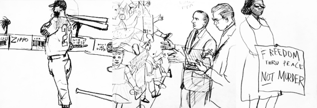
During the 50s and 60s it became common to see illustrations depicting the gritty aspects of current culture: race, crime, sports, war and poverty. This allowed for a new breed of immersive, involved and lively editorial art the likes of which never seen before.

This golden era of Visual Journalism was pioneered by Robert Weaver, and illustrator considered the ‘father’ of Reportage. 

Image
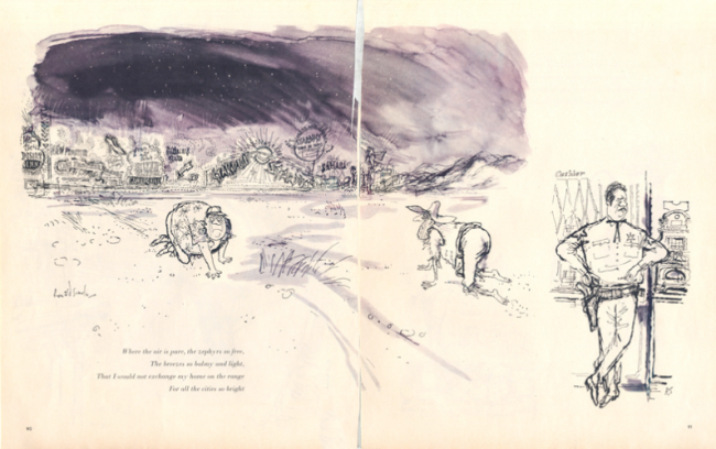
Unlike their predecessors, Weaver and his contemporaries were more interested in drawing scenes from life – as seen in his sketches above.

Robert Weaver was born in 1924 Pittsburgh. His artistic education included a variety of establishments: The Carnegie Institute of Technology, New York’s Art Students League and Le Academia Delle Belle Arti. A brilliant draftsman with a drawing style reminiscent of Ben Shahn and Austin Briggs, he was part of a new breed of illustrators being influenced by the impressionism and expressionism art movements of the 1950s. 

Another influence in both Weaver’s life and the Visual Journalism movement as a whole was Leo Lionni, a dutch illustrator and author. Lionni relocated to America in 1939 and from there out spent the next 23 years as an art director for several advertising firms as well as at ‘Fortune’ Magazine.  Under Lionni, artists were tasked with ‘[doing] the things they weren’t accustomed too’ and under hiencouragement Weaver was pushed to ‘break the rules‘ of traditional illustration .

Image
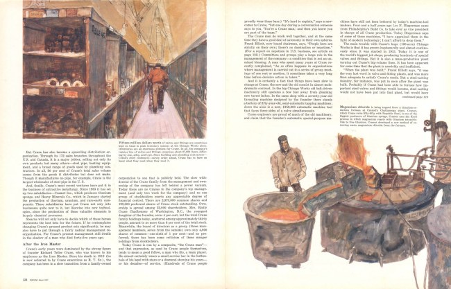
Robert Weaver for ‘Fortune’ magazine, an extract of an editorial on the work of Crane Co. Harmonious use of colour with rough and dry application.

It was during his time at ‘Fortune’, Lionni and Weaver became involved with one another. Weaver would later say that ‘Lionni trusted the artist, and once he picked the right practitioner, he left him alone.’  and of ‘Fortune’ magazine Weaver add: ‘That was Fortune’s policy, to send artists on stories. I was sent to Ohio and Alabama, just all over. Sports Illustrated later did the same thing’.

Roberta Smith of ‘The New York Times’ described Weaver’s style as: ‘[the combination of] loose, rough-hewn rendering, deft abbreviations and sometimes elements of collage, with a startling degree of realism that seemed to capture of essence of any face or pose without resorting to photographic detail.’

This, I feel, sums up my attraction to Weaver’s work. While photo-realistic art is undeniably impressive, there’s something wholly more attractive to me about taking a scene or character and making it recognisably ‘yours’. It is this lack of photographic detail that first drew me to Weaver’s work. I found his impatient, expressive and abstracted style with daring and confident use of line work fascinating – being someone who gets nervous drawing with something as permanent a ball-point pen!

Image
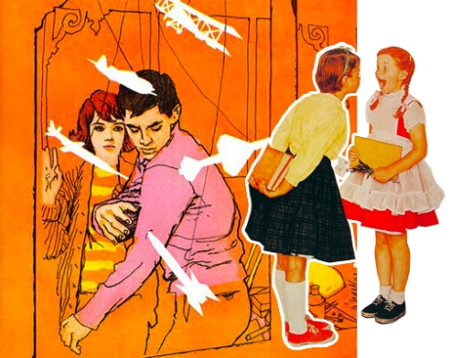
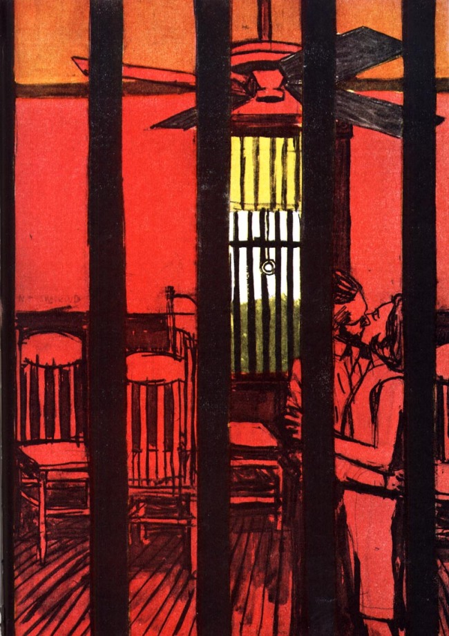
An Illustration for a ‘Cosmopolitan’ editorial.  

Generally, Weaver tended to lend his hand to publications with a primarily male audience, such as ‘Esquire’ or ‘Sports Illustrated’ – not entirely surprising considering the blunt masculinity of his style, which strays from the image of femininity conjured by the stereotypical woman of the 50s. However, I have included above an illustration from a ‘Cosmopolitan’ editorial, showcasing the aforementioned robust draftsmanship of Weaver. What I particularly like about this image is the addition of colour that makes an undeniable impact but does not detract or distract in anyway from the drawing. I also love the chosen perspective and composition, with the view really having to search for the focus of the image – almost as if we are in the shoes of the peeping Tom, trying to capture a glance of this couple stealing a kiss.

From his first job with ‘Town & Country’ in the mid-fifties, Weaver led an exciting 30-year career working from nearly every popular publication of the day: ‘Esquire’, ‘Sports Illustrated’, ‘Charm’, ‘TV Guide’, ‘Look’, ‘Playboy’, ‘The New Yorker’, ‘Seventeen’, ‘Life’, ‘Fortune’. Seeing his work in print never lost it’s excitement to Weaver, some saying the thrill became somewhat of an addiction. In his later years also taught Illustration at the New York’s School of Visual Art, focusing more on this line of his career as magazine illustration falls into decline in favour of photography. 

Robert Weaver had an uncanny ability to invite the viewer into the scenario he was documenting, using multiple images to help inform and a haphazard, bold but accurate style that added to the sense of action and immersive nature of his work. Truly these are qualities as an illustrator I can only hope to one day replicate.


REFERENCES:

Zalkus, D. (2008) Melton Prior Institut: Tiger Hunting with the Shah. A Golden Era of Visual Journalism

http://meltonpriorinstitut.org/pages/textarchive.php5?view=text&ID=172&language=English

Smith, R. (1994) New York Times Obituaries 

(1990) Art Directors Club, Hall of Fame

http://www.adcglobal.org/archive/hof/1990/?id=429

Heller, S. (2003) Illustrator’s Partnership: The End of Illustration?

http://www.illustratorspartnership.org/01_topics/article.php?searchterm=00073

(2013) Treasures and Musings @ Modern Graphic History Library

http://wulibraries.typepad.com/mghlnews/2013/07/happy-birthday-robert-weaver.html

(2012) Illustrated Love Affair

http://illustratedloveaffair.blogspot.co.uk/

Macmillan, N. (2010) Postwar American Visual Culture: The Work of Robert Weaver

http://americanculture.wustl.edu/dowd/f20_4354/macmillan/macmillan/Home.html

Mullen, C.Dr. (2012) Fortune: Robert Weaver – The Crane Co.

http://www.fulltable.com/vts/f/fortune/ills/weaver/b.htm